Introduction
This will take you through the basics of performing a 2D plot in Octave, taking data in from an Excel Spreadsheet.
Figure
The function:
figure
Will create a new figure taking the lowest unused number of figure.

If an input argument is selected for instance
figure(100)
And that figure does not exist, it will create it:

Otherwise it can be used to select a figure, for instance if we wanted to select "Figure 1" again we would type in
figure(1)
This is extremely useful but one should be careful that they don't overwrite a figure by accident when using it.
Data
We need some data to plot. We can create this data in Octave/MATLAB or input it from a spreadsheet in the likes of Excel. We are going to copy data from excel using the variable editor (the copy paste method described here will only work for data that contains numbers, if an excel cell that is copied contains a letter it will not work). In MATLAB we can directly right click the variable editor and create a new variable. In Octave we need to first make a variable and assign it to a scalar before it allows to copy and paste excel data into the variable editor. So for instance using variable names which match the tab in the excel spreadsheet we can type in the following gives a rawdata a scalar of 1:
rawdata=1

We can double click rawdata in the workspace to open up in the variable editor. Here we see a spreadsheet with a single scalar value of 1 as expected. Now we can right click and select paste table which will paste the Excel data:

The excel data is pasted across:

We can then select the other tab of the excel data sheet interdata which is interpolated data calculated from the rawdata. First we will need to create the new variable and assign in to a scalar
interdata=1
Then we can open up interdata in the variable editor by double clicking it in the workspace. You may want to press the x to close rawdata in the variable editor (it will remain in the workspace) to give the most screen space:

Once again we can copy and paste across from excel by right clicking and using Paste Table:

The data we want to plot is now in Octave:

The data I am going to use can also be generated using the script here:
[code language="matlab"]
% Data
rawdata=[0,0;
10,227.04;
15,362.78;
20,517.35;
22.5,602.97;
30,901.67];
% Lower and Upper Limits for interpolation
m=1;
n=30;
% Interpolation Spreadsheet
dataint(:,1)=[m:n]';
dataint(:,2)=interp1(rawdata(:,1),rawdata(:,2),dataint(:,1),'Nearest');
dataint(:,3)=interp1(rawdata(:,1),rawdata(:,2),dataint(:,1),'Linear');
dataint(:,4)=interp1(rawdata(:,1),rawdata(:,2),dataint(:,1),'Pchip');
[/code]
More details about it are available in my guide on Interpolation.
Column Selection
In order to have data to plot, we need to be able to select columns from the variable. I go in quite some details about how to do this in my guide Introduction to Arrays however here what we need to know is that for a variable called variable, in order to select the first column we need to type in variable(:,1). Here : denotes all rows and 1 denotes the first column and the input arguments are enclosed in round brackets and separated with a comma. To select the second column we type in variable(:,2).
Plot
The function plot is a powerful function and takes in multiple input arguments. The first two input arguments should be the x and y data you want to plot.
plot(x,y)
Here we want the x data to be the first column of rawdata and the y data to be the second column of rawdata. Therefore we can assign
x=rawdata(:,1)
y=rawdata(:,2)

We can then create a new figure by typing in
figure

Now we can type in
plot(x,y)

The figure here is very basic. Notice how the blue line is narrow and the text is quite tiny. There is also no axis label or legend. All of these can be tweaked with additional lines of code. Let us open up the Editor tab and create a new script and paste the last line into it:

We can then press the save button, once we do this a dialogue box shows and we can input a script name and select save. More details about variable names are in my guide Introduction to Arrays.

Line Width
Let's us first thicken the line so we can see it in more detail, to do this we need to add the additional input argument(s) 'LineWidth' and 5.
plot(x,y,'LineWidth',5)

Notice how we type in ' ' around the word LineWidth and it changes colour 'LineWidth' this is because LineWidth unenclosed would be taken by Octave/MATLAB as a variable or function. Instead we want this input argument to be a line of text, known as a string. These input arguments are matched so we must immediately specify the line width we wish to use, in this case we are using the scalar 5. In general these functions are setup so the case of the string doesn't matter 'LineWidth' or 'linewidth' should work equally well.
Note: The colours shown in the script editor are different to the ones I am using in these notes, because I am using colours to highlight some things.

When editing code in the script editor, be sure to save it before you run it by pressing the save button. Unsaved code will have a * at the beginning of the title as shown. Once saved right click the script and select run:

Now the Line Width is updated to a thickness of 5:

Font Size
Another thing that is hard to see is the text. To update the size of this we need to use the function
set(gca,'FontSize',20)
We need to use this function set with 3 input arguments gca stands for get current axis meaning you are changing the properties of the axis. As we want to change the Font Size we need to use the word 'FontSize' and accompany it with the desired Font Size in this case 20. Save and rerunning the script we get the axes with the increased font size.

Line Colour
To change the colour of the line we can add two additional input arguments:
plot(x,y,'Color','Red','LineWidth',5)
Here we need to be careful because Octave/MATLAB use American English and not British English, so we need to spell colour as color. This input argument needs to be followed by the colour. As you can see the line is now red opposed to blue.

In the code above 'Color', 'Red', 'LineWidth' and 'FontSize' are all strings and must be enclosed by ' ' . The abbreviated string 'r' can be used in the place of 'Red'. However all colours are made from a mixture of three primary colours – red, green and blue. A colour can be expressed as a [r,g,b] row vector opposed to a string.

MATLAB/Octave have the following strings for the primary and secondary colours:
![\displaystyle \begin{array}{*{20}{c}} {\text{Specifier Long}} & {\text{Specifier}} & {\text{RGB Row Vector}} \\ {\text{black}} & \text{k} & {\left[ {0,0,0} \right]} \\ {\text{red}} & \text{r} & {\left[ {1,0,0} \right]} \\ {\text{green}} & \text{g} & {\left[ {0,1,0} \right]} \\ {\text{blue}} & \text{b} & {\left[ {0,0,1} \right]} \\ {\text{yellow}} & \text{y} & {\left[ {1,1,0} \right]} \\ {\text{magenta}} & \text{m} & {\left[ {1,0,1} \right]} \\ {\text{cyan}} & \text{c} & {\left[ {0,1,1} \right]} \\ {\text{white}} & \text{w} & {\left[ {1,1,1} \right]} \end{array}](https://s0.wp.com/latex.php?latex=%5Cdisplaystyle+%5Cbegin%7Barray%7D%7B%2A%7B20%7D%7Bc%7D%7D+%7B%5Ctext%7BSpecifier+Long%7D%7D+%26+%7B%5Ctext%7BSpecifier%7D%7D+%26+%7B%5Ctext%7BRGB+Row+Vector%7D%7D+%5C%5C+%7B%5Ctext%7Bblack%7D%7D+%26+%5Ctext%7Bk%7D+%26+%7B%5Cleft%5B+%7B0%2C0%2C0%7D+%5Cright%5D%7D+%5C%5C+%7B%5Ctext%7Bred%7D%7D+%26+%5Ctext%7Br%7D+%26+%7B%5Cleft%5B+%7B1%2C0%2C0%7D+%5Cright%5D%7D+%5C%5C+%7B%5Ctext%7Bgreen%7D%7D+%26+%5Ctext%7Bg%7D+%26+%7B%5Cleft%5B+%7B0%2C1%2C0%7D+%5Cright%5D%7D+%5C%5C+%7B%5Ctext%7Bblue%7D%7D+%26+%5Ctext%7Bb%7D+%26+%7B%5Cleft%5B+%7B0%2C0%2C1%7D+%5Cright%5D%7D+%5C%5C+%7B%5Ctext%7Byellow%7D%7D+%26+%5Ctext%7By%7D+%26+%7B%5Cleft%5B+%7B1%2C1%2C0%7D+%5Cright%5D%7D+%5C%5C+%7B%5Ctext%7Bmagenta%7D%7D+%26+%5Ctext%7Bm%7D+%26+%7B%5Cleft%5B+%7B1%2C0%2C1%7D+%5Cright%5D%7D+%5C%5C+%7B%5Ctext%7Bcyan%7D%7D+%26+%5Ctext%7Bc%7D+%26+%7B%5Cleft%5B+%7B0%2C1%2C1%7D+%5Cright%5D%7D+%5C%5C+%7B%5Ctext%7Bwhite%7D%7D+%26+%5Ctext%7Bw%7D+%26+%7B%5Cleft%5B+%7B1%2C1%2C1%7D+%5Cright%5D%7D+%5Cend%7Barray%7D&bg=ffffff&fg=000000&s=0&c=20201002)
Black is shown in the absence of these three colours and white is shown when these three colours are at full brightness.
Many programs list colors in 8 bit, that means they list 

Select your colour and then select custom:

You now get your RGB values listed from 0 to 255. We can normalise these to 255 but dividing them through by 255 when using them in Octave/MATLAB:

Updating the code to plot the line in this colour
plot(x,y,'Color',[51/255,51/255,255/255],'LineWidth',5)

Other programs like Microsoft Paint also have colour pickers, you only need the [r,g,b] row vector values and can ignore the Hue, Sat and Lum:

Line Style
Octave/MATLAB also has a number of different types of lines, by default the line is a solid line however another two input arguments can be input to change these:
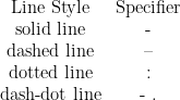
Once again 'LineStyle' and '--' are both strings and must be enclosed in ' '
plot(x,y,'Color',[51/255,51/255,255/255], 'LineStyle','--','LineWidth',5)

plot(x,y,'Color',[51/255,51/255,255/255], 'LineStyle',':','LineWidth',5)

plot(x,y,'Color',[51/255,51/255,255/255], 'LineStyle','-.','LineWidth',5)

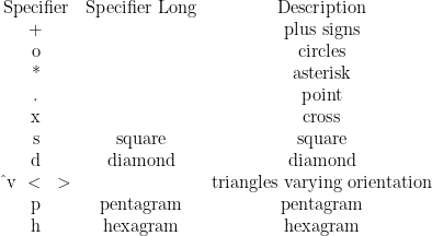
Marker
Markers can also be added to the line using two more additional input arguments:
plot(x,y,'Color',[51/255,51/255,255/255], 'LineStyle',':','LineWidth',5,'Marker','s')
Once again 'Marker' and 's' are both strings and must be enclosed in ' '
To see this in the script editor I have split the code on separate lines by pressing enter after the commas, input arguments are shown in pairs. The code will still run like this.

Marker Size
The markers above were quite small, they are hard to read, this can be resolved by using another two additional input arguments:
plot(x,y,'Color',[51/255,51/255,255/255], 'LineStyle',':','LineWidth',5,'Marker','s','MarkerSize',20)
Once again 'MarkerSize' is a string and must be enclosed in ' ' and 20 is a scalar.

Marker Edge and Face
The Marker does not need to be the same colour as the line. We can specify both the Edge and the Fill of the marker with another colour using another four input arguments. Once again 'MarkerFace' and 'MarkerEdge' are both strings and must be enclosed in ' '. Each of them has a paired input argument, which uses the same notation as the line color (see above), I will use the [r,g,b] row vector notation.
plot(x,y,'Color',[51/255,51/255,255/255], 'LineStyle',':','LineWidth',5,'Marker','s','MarkerSize',20,'MarkerEdge' ,[0/255,176/255,80/255],'MarkerFace' ,[255/255,0/255,0/255])

Short Hand
For learning pairing the inputs may help for using the plot function but it is quite useful to use the abbreviated notation.
plot(x,y, 'color','b','LineStyle',':','Marker','s','LineWidth',5,'MarkerSize',20,'MarkerFace','g','MarkerEdge','r')
plot(x,y,'b:s','LineWidth',5,'MarkerSize',20,'MarkerFace','g','MarkerEdge','r')

Scatter using Plot
There is a dedicated separate function scatter which works similarly to plot and has some slight advantages but has slightly different input arguments, I'm not looking to cover it here as one can also make a scatter plot by using the short hand notation for plot, the long hand notation does not work because it will default to plot a line if the input argument 'LineStyle' is absent:
plot(x,y,'bs','MarkerSize',20,'MarkerFace','g','MarkerEdge','r')

Grid Lines
One can enable the grid by using the command
grid('on')
grid on

And also the minor grid lines by using the command
grid('minor')
grid minor

Axis Limits
When we changed the size of the font, we used the function
set(gca,'FontSize',20)
With gca standing for get current axis meaning you are changing the properties of the axis. To change the axis limits we use the same function with different input arguments or alternatively we can combine the input arguments and put them on one line.
This time the input argument is 'XLim' an abbreviation for x limits and is a string so must be enclosed in ' '. It's matched input argument is a 2 by 1 row vector consisting of the upper and lower x limits respectively.
set(gca,'XLim',[xlower,xupper])
Likewise we have the input argument is 'YLim' an abbreviation for y limits and is likewise a string so must be enclosed in ' '. It's matched input argument is also a 2 by 1 row vector this time consisting of the upper and lower y limits respectively.
set(gca,'YLim',[ylower,yupper])
These can be combined so
set(gca,'XLim',[xlower,xupper],'YLim',[ylower,yupper])
For instance if we want to change the limits for xlower=0, xupper=12, ylower=0 and yupper=300
set(gca,'XLim',[0,12],'YLim',[0,300])

Axis Scale
We can also set the axes scale to log using
set(gca,'XScale','Log')
set(gca,'YScale','Log')
'Log'is a string so must be enclosed in ' '.
In this case only changing the y axis to log

Axis Labels and Title
There are three functions to label the x-axis, y-axis and the figure title these are
xlabel('your x label')
ylabel('your y label')
title('your title')
In my case, the chart labels are
xlabel('time (s)')
ylabel('speed (m/s)')
title('speed of a rocket with respect to time')
Note how the brackets enclosed within the ' ' are treated as text and not as part of the code.

Quite often one may have created a cell array with the labels, these can also be input as axis labels. To create a cell array, one needs to use curly brackets. We can create for instance
mytestlabels={'test time (s)','test speed (m/s)','test speed of a rocket with respect to time'}
xlabel(mytestlabels(1))
ylabel(mytestlabels(2))
title(mytestlabels(3))

Legend
The graph is missing a legend we can add one using the following function
legend('label1','Location','NorthWest')
For the location we use the compass points, these are usually within the chart area but we can also specify for them to be outside. Best is leaving MATLAB/Octave to find the best location:

I will use
legend('rawdata','Location','NorthWest')

Now for comparison I will use
legend('rawdata','Location','SouthOutside')

Plotting Multiple Line Plots in a Single Figure
For this next part, I want the raw data to be plotted using red dots and no line.
[code language="matlab"]
figure
% create a new figure
% x data is rawdata(:,1)
% y data is rawdata(:,2)
plot(rawdata(:,1),rawdata(:,2),'bo','MarkerSize',20,'MarkerFace','r','MarkerEdge','r')
% plot red circles with a red face and edge, size 20, no line
set(gca,'FontSize',20)
% change axes font size to 20
xlabel('time (s)')
ylabel('speed (m/s)')
title('speed of a rocket with respect to time')
% label figure
grid on
grid minor
% add grid lines&amp;amp;amp;lt;/pre&amp;amp;amp;gt;
&amp;amp;amp;lt;pre&amp;amp;amp;gt;[/code]

To this plot, we want to add a straight dotted line of the nearest point interpolated data from the variable dataint (x data is dataint(:,1) and y data is dataint(:,2)) which is size 5 and is dotted. Therefore we can add the following line of code
plot(dataint(:,1),dataint(:,2),'Color','b', 'LineStyle',':','LineWidth',5)
Since the code starts with figure Octave/MATLAB will create a new figure, in the case the lowest unused figure is Figure 2. To Figure 2, Octave plotted the rawdata with red markers but then it seen a new plot command and replotted the dataint as a blue dotted line removing the former plot of raw data with red markers.

To prevent if from doing this we use the commands
hold('on')
Which also works in the form:
hold on
plot(dataint(:,1),dataint(:,2),'Color','b', 'LineStyle',':','LineWidth',5)
hold('off')
hold off
The hold on command holds the current plot, while this is active, any other plot command will add to the existing figure, opposed to overwriting the previous figure. The hold off command should be used when finished adding all the data you want to the current figure and then if you want to create a separate figure you should use the command figure afterwards.
Closing figure 1 and figure 2 and relaunching the updated script:

Now we can see how the nearest interpolation looks with respect to the original data. Since the plot now has two items, a combined legend can be made:
legend('rawdata','nearest point interpolation','Location','NorthWest')

The code is like
[code language="matlab"]
figure
% create a new figure
% x data is rawdata(:,1)
% y data is rawdata(:,2)
plot(rawdata(:,1),rawdata(:,2),'bo','MarkerSize',20,'MarkerFace','r','MarkerEdge','r')
% plot red circles with a red face and edge, size 20, no line
set(gca,'FontSize',20)
% change axes font size to 20
xlabel('time (s)')
ylabel('speed (m/s)')
title('speed of a rocket with respect to time')
% label figure
grid on
grid minor
% add grid lines
hold on
plot(dataint(:,1),dataint(:,2),'Color','b', 'LineStyle',':','LineWidth',5)
hold off
% Add the Interpolated Data Line to the Plot
legend('rawdata','nearest point interpolation','Location','NorthWest')
[/code]
In separate figures I also want the linear interpolated data and cubic interpolated data. These are the 3rd and 4th column of dataint respectively. To do this I can copy and paste the above code 3 times and update line 17 to use the 3rd and 4th column instead of the second and line 20 to update the legend labels accordingly.

[code language="matlab"]
figure
% create a new figure
% x data is rawdata(:,1)
% y data is rawdata(:,2)
plot(rawdata(:,1),rawdata(:,2),'bo','MarkerSize',20,'MarkerFace','r','MarkerEdge','r')
% plot red circles with a red face and edge, size 20, no line
set(gca,'FontSize',20)
% change axes font size to 20
xlabel('time (s)')
ylabel('speed (m/s)')
title('speed of a rocket with respect to time')
% label figure
grid on
grid minor
% add grid lines
hold on
plot(dataint(:,1),dataint(:,2),'Color','b', 'LineStyle',':','LineWidth',5)
hold off
% Add the Interpolated Data Line to the Plot
legend('rawdata','nearest point interpolation','Location','NorthWest')
figure
% create a new figure
% x data is rawdata(:,1)
% y data is rawdata(:,2)
plot(rawdata(:,1),rawdata(:,2),'bo','MarkerSize',20,'MarkerFace','r','MarkerEdge','r')
% plot red circles with a red face and edge, size 20, no line
set(gca,'FontSize',20)
% change axes font size to 20
xlabel('time (s)')
ylabel('speed (m/s)')
title('speed of a rocket with respect to time')
% label figure
grid on
grid minor
% add grid lines
hold on
plot(dataint(:,1),dataint(:,3),'Color','b', 'LineStyle',':','LineWidth',5)
hold off
% Add the Interpolated Data Line to the Plot
legend('rawdata','linear interpolation','Location','NorthWest')
figure
% create a new figure
% x data is rawdata(:,1)
% y data is rawdata(:,2)
plot(rawdata(:,1),rawdata(:,2),'bo','MarkerSize',20,'MarkerFace','r','MarkerEdge','r')
% plot red circles with a red face and edge, size 20, no line
set(gca,'FontSize',20)
% change axes font size to 20
xlabel('time (s)')
ylabel('speed (m/s)')
title('speed of a rocket with respect to time')
% label figure
grid on
grid minor
% add grid lines
hold on
plot(dataint(:,1),dataint(:,4),'Color','b', 'LineStyle',':','LineWidth',5)
hold off
% Add the Interpolated Data Line to the Plot
legend('rawdata','cubic interpolation','Location','NorthWest')
[/code]
Subplots
We have three separate figures, it is possible to combine them together using a subplot. Subplotting essentially splits the figure window up into a m by n matrix

For example in the case above where m=2 and n=2
figure
subplot(2,2,1)
plot(...)
subplot(2,2,2)
plot(...)
subplot(2,2,3)
plot(...)
subplot(2,2,4)
plot(...)

For example in the case above where m=3 and n=3
figure
subplot(3,3,1)
plot(...)
subplot(3,3,2)
plot(...)
subplot(3,3,3)
plot(...)
subplot(3,3,4)
plot(...)
subplot(3,3,5)
plot(...)
subplot(3,3,6)
plot(...)
subplot(3,3,7)
plot(...)
subplot(3,3,8)
plot(...)
subplot(3,3,9)
plot(...)

Not all subplots need to be the same size, the third element can be set as a row vector. In the case of wanting 3 small plots at the top and one large plot at the bottom the following can be used
figure
subplot(3,3,1)
plot(...)
subplot(3,3,2)
plot(...)
subplot(3,3,3)
plot(...)
subplot(3,3,[4:9])
plot(...)
I can change my code to plot the three charts in a 1 by 3 subplot by editing lines 2, 22 and 42 to add in subplot and to remove figure which was at lines 22 and 42.
[code language="matlab"]
figure
subplot(1,3,1)
% create a new figure
% x data is rawdata(:,1)
% y data is rawdata(:,2)
plot(rawdata(:,1),rawdata(:,2),'bo','MarkerSize',20,'MarkerFace','r','MarkerEdge','r')
% plot red circles with a red face and edge, size 20, no line
set(gca,'FontSize',20)
% change axes font size to 20
xlabel('time (s)')
ylabel('speed (m/s)')
title('speed of a rocket with respect to time')
% label figure
grid on
grid minor
% add grid lines
hold on
plot(dataint(:,1),dataint(:,2),'Color','b', 'LineStyle',':','LineWidth',5)
hold off
% Add the Interpolated Data Line to the Plot
legend('rawdata','nearest point interpolation','Location','NorthWest')
subplot(1,3,2)
% create a new figure
% x data is rawdata(:,1)
% y data is rawdata(:,2)
plot(rawdata(:,1),rawdata(:,2),'bo','MarkerSize',20,'MarkerFace','r','MarkerEdge','r')
% plot red circles with a red face and edge, size 20, no line
set(gca,'FontSize',20)
% change axes font size to 20
xlabel('time (s)')
ylabel('speed (m/s)')
title('speed of a rocket with respect to time')
% label figure
grid on
grid minor
% add grid lines
hold on
plot(dataint(:,1),dataint(:,3),'Color','b', 'LineStyle',':','LineWidth',5)
hold off
% Add the Interpolated Data Line to the Plot
legend('rawdata','linear interpolation','Location','NorthWest')
subplot(1,3,3)
% create a new figure
% x data is rawdata(:,1)
% y data is rawdata(:,2)
plot(rawdata(:,1),rawdata(:,2),'bo','MarkerSize',20,'MarkerFace','r','MarkerEdge','r')
% plot red circles with a red face and edge, size 20, no line
set(gca,'FontSize',20)
% change axes font size to 20
xlabel('time (s)')
ylabel('speed (m/s)')
title('speed of a rocket with respect to time')
% label figure
grid on
grid minor
% add grid lines
hold on
plot(dataint(:,1),dataint(:,4),'Color','b', 'LineStyle',':','LineWidth',5)
hold off
% Add the Interpolated Data Line to the Plot
legend('rawdata','cubic interpolation','Location','NorthWest')
[/code]

In this case the legend's don't look so great so I can change their Location from 'NorthWest' to 'SouthOutside'. To do this quickly I can use find and replace by pressing [Ctrl] and [ f ]


Octave struggles a little as the font size I am using is much larger than the default. :

Custom Plot Function
As you seen, by default Octave plots a line like:
Which isn't very aesthetically pleasing. Say we prefer plotting a red dotted line of Line Width 5, have axes of Font Size 20 and have both the major and minor grid lines on, we can create a function to do so. To create a function:

You will need to specify a name for the function. Function names follow the same rules as the rules for variables or for scripts, see my guide assigning variable names for more details.

We can remove all the comments at the top.

This will give you the following:
function retval = plot1(input1, input2)
endfunction
To make the code MATLAB compatible it is recommended to change endfunction to end so
function retval = plot1(input1, input2)
end
Functions have their own internal workspace which is separate from the main workspace. The only way to get variables into the functions internal workspace from the workspace is to use inputs and the only way to get variables back into the workspace from the functions internal workspace is to use outputs.

Since we are looking to create a plot and not wanting any output variables in the main workspace we can remove the output variable thus:
function plot1(input1, input2)
end
And since the input variables we want are going to be x data and y data respectively we might as well call them x and y.
function plot1(x, y)
end
Once this function is created if we type in
plot1(a, b)
The function will set the variable a from the workspace to the variable xin the functions workspace. If there is a variable x specified in the workspace it will not influence the variable x specified in the functions workspace. Likewise if there is a variable a in the function's workspace it will not influence the variable a in the workspace. Now that we have the input arguments which have been set to x and y respectively, we can now put plot commands in the function's workspace data using x and y:
function plot1(x, y)
plot(x,y,'r:','LineWidth',5);
set(gca, 'FontSize',20);
grid on;
grid minor;
xlabel('x')
ylabel('y')
end

We can use the function by typing in
plot1(dataint(:,1),dataint(:,2))
in the command window and pressing [Enter].

plot1(dataint(:,1),dataint(:,3))

plot1(dataint(:,1),dataint(:,4))

Or using other data instead such as the raw data
plot1(rawdata(:,1),rawdata(:,2))

[code language="matlab"]
% This will plot a dotted red line of thickness 5.
% The graph will have gridlines and the font size will be 20
% x and y labels are applied
% save as plot1
function plot1 (x, y)
plot(x,y,'r:','LineWidth',5);
set(gca, 'FontSize',20);
grid on;
grid minor;
xlabel('x')
ylabel('y')
end
[/code]
Add notes on axis
axis('tight')

axis('square')
Add notes on
myfig1=figure
myplot=plot(x,y)
Get Current Axes (gca)
Get Current Figure (gcf)
Get Current Object (gco)
myplot.Color
myplot.MarkerFaceColor
mplot.xData
myplot.yData
gca.XAxisLocation='top'
gca.XTick=[1,2,3,4]
gca.XTickLabel={'1','2','3','4'}
gca.XTixkLabelRotation=45
ax1=axes
ax2=axes('position',[left,bottom,width,height])
